
.svg)


Typeface Design Brief
Title: Knight Typeface
Category: Editorial Design / Print & Digital
Target Audience: Knight is designed for creative professionals, branding agencies, and editorial designers seeking a bold, futuristic typeface for high-impact visual communication. Its geometric sharpness and forward-leaning posture appeal to fashion, technology, and entertainment brands that value innovation, energy, and visual edge. Ideal for use in headlines, logos, posters, and digital interfaces where type is meant to lead.
Background: Knight is a custom-designed typeface that combines angular geometry with forward-leaning energy, creating a distinct sense of strength and sophistication. Each character features sharp, clean lines and irregular structures, lending the typeface a bold, futuristic quality while maintaining clarity and legibility. Knight is intended for use in editorial design, branding, signage, and packaging — any application where type is meant to standout and convey power, movement, and innovation.
Design Problem: Create a unique and versatile typeface suitable for editorial design across both print and digital applications — one that stands out while remaining functional and legible.
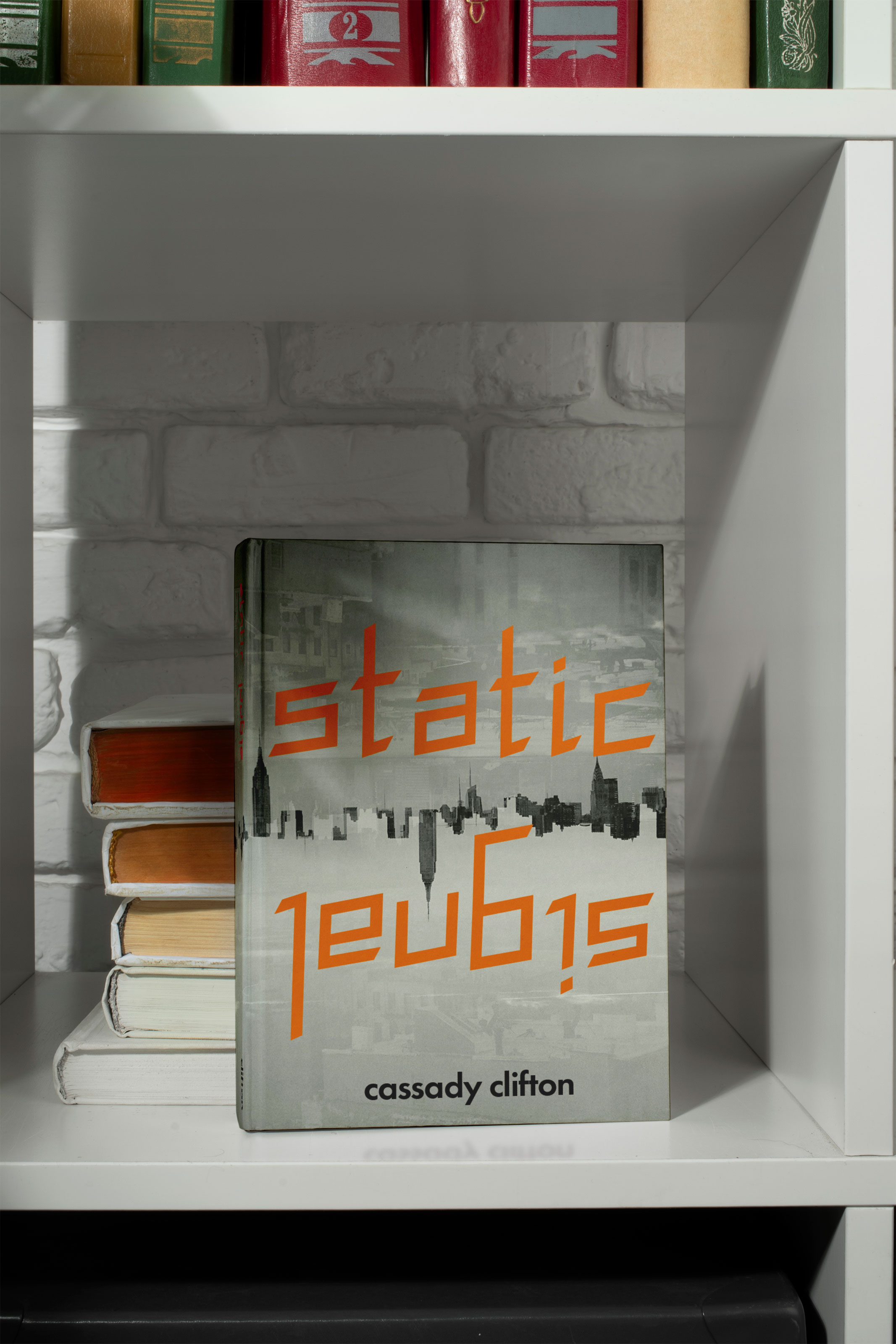
This gallery showcases Knight in use across various editorial and branding contexts, emphasizing its bold personality and historical roots. Each mockup demonstrates how the typeface performs at different scales and in different settings—highlighting its potential as a striking headline font for contemporary design with a medieval edge.


This section documents the development of Knight, a custom display typeface inspired by bobbypins and medieval forms. Early photographs, explorations, and vector refinements show the iterative process behind the letterforms. Each stage focused on balancing dramatic contrast and angular tension with legibility and consistency across the character set.


